Alkyd Landscape Prints

to
1
1
Overall Width
to
Overall Height
to
1
1
2
1
1
1
1
1
1
1
1
1
56
4,282
3,624
2,737
1,424
2
Medium: Alkyd
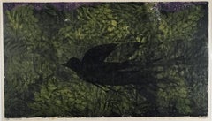
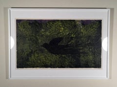
NIGHT FLIGHT
NIGHT FLIGHT

NIGHT FLIGHT

By Antonio Frasconi

Located in Portland, ME

Frasconi, Antonio. NIGHT FLIGHT. Color Woodcut, 1958. Edition of 20. Signed and dated, numbered 10/20, and inscribed "imp," all in pencil. 19 x 34 inches,...

Category

1950s Alkyd Landscape Prints

Materials

Alkyd, Woodcut

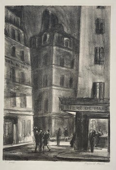
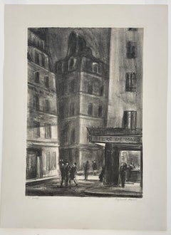
RUE ST. JACQUES
RUE ST. JACQUES

RUE ST. JACQUES

By Reginald Marsh

Located in Portland, ME

Marsh, Reginald (American, 1898-1954) RUE ST. JACQUES. S.5 Lithograph, 1928. Edition of 36 per Sasowsky, citing Marsh's notebook, but inscribed, lower left, "35 Proofs," and signed in pencil, lower right. 12 1/2 x 8 1/2 inches, 317 x 215 mm. (image). One of the series of lithographs...

Category

1920s Alkyd Landscape Prints

Materials

Alkyd, Lithograph

Related Items
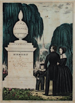
19th century color lithograph figures cemetery willow tree memorial headstone

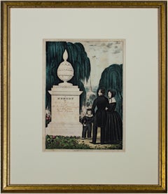
19th century color lithograph figures cemetery willow tree memorial headstone

By Nathaniel Currier

Located in Milwaukee, WI

The present hand-colored lithograph was produced as part of the funeral and mourning culture in the United States during the 19th century. Images like this were popular as ways of remembering loved ones, an alternative to portraiture of the deceased. This lithograph shows a man, woman and child in morning clothes next to an urn-topped stone monument. Behind are additional putto-topped headstones beneath weeping willows, with a steepled church beyond. The monument contains a space where a family could inscribe the name and death dates of a deceased loved one. In this case, it has been inscribed to a young Civil War soldier: William W. Peabody Died at Fairfax Seminary, VA December 18th, 1864 Aged 18 years The young Mr. Peabody probably died in service for the Union during the American Civil War. Farifax Seminary was a Union hospital and military headquarters in Alexandria, Virginia. The hospital served nearly two thousand soldiers during the war time. Five hundred were also buried on the Seminary's grounds. 13.75 x 9.5 inches, artwork 23 x 19 inches, frame Published before 1864 Inscribed bottom center "Lith. & Pub. by N. Currier. 2 Spruce St. N.Y." Framed to conservation standards using 100 percent rag matting and TruVue Conservation Clear glass, housed in a gold gilded moulding. Nathaniel Currier was a tall introspective man with a melancholy nature. He could captivate people with his piercing stare or charm them with his sparkling blue eyes. Nathaniel was born in Roxbury, Massachusetts on March 27th, 1813, the second of four children. His parents, Nathaniel and Hannah Currier, were distant cousins who lived a humble yet spartan life. When Nathaniel was eight years old, tragedy struck. Nathaniel’s father unexpectedly passed away leaving Nathaniel and his eleven-year-old brother Lorenzo to provide for the family. In addition to their mother, Nathaniel and Lorenzo had to care for six-year-old sister Elizabeth and two-year-old brother Charles. Nathaniel worked a series of odd jobs to support the family, and at fifteen, he started what would become a life-long career when he apprenticed in the Boston lithography shop of William and John Pendleton. A Bavarian gentleman named Alois Senefelder invented lithography just 30 years prior to young Nat Currier’s apprenticeship. While under the employ of the brothers Pendleton, Nat was taught the art of lithography by the firm’s chief printer, a French national named Dubois, who brought the lithography trade to America. Lithography involves grinding a piece of limestone flat and smooth then drawing in mirror image on the stone with a special grease pencil. After the image is completed, the stone is etched with a solution of aqua fortis leaving the greased areas in slight relief. Water is then used to wet the stone and greased-ink is rolled onto the raised areas. Since grease and water do not mix, the greased-ink is repelled by the moisture on the stone and clings to the original grease pencil lines. The stone is then placed in a press and used as a printing block to impart black on white images to paper. In 1833, now twenty-years old and an accomplished lithographer, Nat Currier left Boston and moved to Philadelphia to do contract work for M.E.D. Brown, a noted engraver and printer. With the promise of good money, Currier hired on to help Brown prepare lithographic stones of scientific images for the American Journal of Sciences and Arts. When Nat completed the contract work in 1834, he traveled to New York City to work once again for his mentor John Pendleton, who was now operating his own shop located at 137 Broadway. Soon after the reunion, Pendleton expressed an interest in returning to Boston and offered to sell his print shop to Currier. Young Nat did not have the financial resources to buy the shop, but being the resourceful type he found another local printer by the name of Stodart. Together they bought Pendleton’s business. The firm ‘Currier & Stodart’ specialized in "job" printing. They produced many different types of printed items, most notably music manuscripts for local publishers. By 1835, Stodart was frustrated that the business was not making enough money and he ended the partnership, taking his investment with him. With little more than some lithographic stones, and a talent for his trade, twenty-two year old Nat Currier set up shop in a temporary office at 1 Wall Street in New York City. He named his new enterprise ‘N. Currier, Lithographer’ Nathaniel continued as a job printer and duplicated everything from music sheets to architectural plans. He experimented with portraits, disaster scenes and memorial prints, and any thing that he could sell to the public from tables in front of his shop. During 1835 he produced a disaster print Ruins of the Planter's Hotel, New Orleans, which fell at two O’clock on the Morning of the 15th of May 1835, burying 50 persons, 40 of whom Escaped with their Lives. The public had a thirst for newsworthy events, and newspapers of the day did not include pictures. By producing this print, Nat gave the public a new way to “see” the news. The print sold reasonably well, an important fact that was not lost on Currier. Nat met and married Eliza Farnsworth in 1840. He also produced a print that same year titled Awful Conflagration of the Steamboat Lexington in Long Island Sound on Monday Evening, January 18, 1840, by which melancholy occurrence over One Hundred Persons Perished. This print sold out very quickly, and Currier was approached by an enterprising publication who contracted him to print a single sheet addition of their paper, the New York Sun. This single page paper is presumed to be the first illustrated newspaper ever published. The success of the Lexington print launched his career nationally and put him in a position to finally lift his family up. In 1841, Nat and Eliza had their first child, a son they named Edward West Currier. That same year Nat hired his twenty-one year old brother Charles and taught him the lithography trade, he also hired his artistically inclined brother Lorenzo to travel out west and make sketches of the new frontier as material for future prints. Charles worked for the firm on and off over the years, and invented a new type of lithographic crayon which he patented and named the Crayola. Lorenzo continued selling sketches to Nat for the next few years. In 1843, Nat and Eliza had a daughter, Eliza West Currier, but tragedy struck in early 1847 when their young daughter died from a prolonged illness. Nat and Eliza were grief stricken, and Eliza, driven by despair, gave up on life and passed away just four months after her daughter’s death. The subject of Nat Currier’s artwork changed following the death of his wife and daughter, and he produced many memorial prints and sentimental prints during the late 1840s. The memorial prints generally depicted grief stricken families posed by gravestones (the stones were left blank so the purchasers could fill in the names of the dearly departed). The sentimental prints usually depicted idealized portraits of women and children, titled with popular Christian names of the day. Late in 1847, Nat Currier married Lura Ormsbee, a friend of the family. Lura was a self-sufficient woman, and she immediately set out to help Nat raise six-year-old Edward and get their house in order. In 1849, Lura delivered a son, Walter Black Currier, but fate dealt them a blow when young Walter died one year later. While Nat and Lura were grieving the loss of their new son, word came from San Francisco that Nat’s brother Lorenzo had also passed away from a brief illness. Nat sank deeper into his natural quiet melancholy. Friends stopped by to console the couple, and Lura began to set an extra place at their table for these unexpected guests. She continued this tradition throughout their lives. In 1852, Charles introduced a friend, James Merritt Ives, to Nat and suggested he hire him as a bookkeeper. Jim Ives was a native New Yorker born in 1824 and raised on the grounds of Bellevue Hospital where his father was employed as superintendent. Jim was a self-trained artist and professional bookkeeper. He was also a plump and jovial man, presenting the exact opposite image of his new boss. Jim Ives met Charles Currier through Caroline Clark, the object of Jim’s affection. Caroline’s sister Elizabeth was married to Charles, and Caroline was a close friend of the Currier family. Jim eventually proposed marriage to Caroline and solicited an introduction to Nat Currier, through Charles, in hopes of securing a more stable income to support his future wife. Ives quickly set out to improve and modernize his new employer’s bookkeeping methods. He reorganized the firm’s sizable inventory, and used his artistic skills to streamline the firm’s production methods. By 1857, Nathaniel had become so dependent on Jims’ skills and initiative that he offered him a full partnership in the firm and appointed him general manager. The two men chose the name ‘Currier & Ives’ for the new partnership, and became close friends. Currier & Ives produced their prints in a building at 33 Spruce Street where they occupied the third, fourth and fifth floors. The third floor was devoted to the hand operated printing presses that were built by Nat's cousin, Cyrus Currier, at his shop Cyrus Currier & Sons in Newark, NJ. The fourth floor found the artists, lithographers and the stone grinders at work. The fifth floor housed the coloring department, and was one of the earliest production lines in the country. The colorists were generally immigrant girls, mostly German, who came to America with some formal artistic training. Each colorist was responsible for adding a single color to a print. As a colorist finished applying their color, the print was passed down the line to the next colorist to add their color. The colorists worked from a master print displayed above their table, which showed where the proper colors were to be placed. At the end of the table was a touch up artist who checked the prints for quality, touching-in areas that may have been missed as it passed down the line. During the Civil War, demand for prints became so great that coloring stencils were developed to speed up production. Although most Currier & Ives prints were colored in house, some were sent out to contract artists. The rate Currier & Ives paid these artists for coloring work was one dollar per one hundred small folios (a penny a print) and one dollar per one dozen large folios. Currier & Ives also offered uncolored prints to dealers, with instructions (included on the price list) on how to 'prepare the prints for coloring.' In addition, schools could order uncolored prints from the firm’s catalogue to use in their painting classes. Nathaniel Currier and James Merritt Ives attracted a wide circle of friends during their years in business. Some of their more famous acquaintances included Horace Greeley, Phineas T. Barnum, and the outspoken abolitionists Rev. Henry Ward, and John Greenleaf Whittier (the latter being a cousin of Mr. Currier). Nat Currier and Jim Ives described their business as "Publishers of Cheap and Popular Pictures" and produced many categories of prints. These included Disaster Scenes, Sentimental Images, Sports, Humor, Hunting Scenes, Politics, Religion, City and Rural Scenes, Trains, Ships, Fire Fighters, Famous Race Horses, Historical Portraits, and just about any other topic that satisfied the general public's taste. In all, the firm produced in excess of 7500 different titles, totaling over one million prints produced from 1835 to 1907. Nat Currier retired in 1880, and signed over his share of the firm to his son Edward. Nat died eight years later at his summer home 'Lion’s Gate' in Amesbury, Massachusetts. Jim Ives remained active in the firm until his death in 1895, when his share of the firm passed to his eldest son, Chauncey. In 1902, faced will failing health from the ravages of Tuberculosis, Edward Currier sold his share of the firm to Chauncey Ives...

Category

Mid-19th Century Romantic Alkyd Landscape Prints

Materials

Watercolor, Lithograph
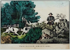
19th century color lithograph watercolor landscape figurative animal print

19th century color lithograph watercolor landscape figurative animal print

By Nathaniel Currier

Located in Milwaukee, WI

The present hand-colored lithograph presents the viewer with a hunting scene in a picturesque landscape. In the foreground, a man approaches two partridges as his two pointers prepare to flush them out. Beyond, a white fence draws our eyes to the homestead in the distance. Images like this one show how people in the United States were trying to identify themselves as a new nation in the North American landscape - as separate from their European counterparts but with similar similar and specific wildlife and magesties of nature. It also identifies hunting in this landscape as an American pastime. 9.25 x 12.5 inches, artwork 18.38 x 22 inches, frame Entitled bottom center "Partridge Shooting...

Category

Mid-19th Century Romantic Alkyd Landscape Prints

Materials

Watercolor, Lithograph
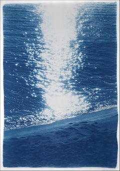
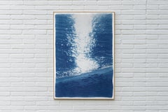
Dark Beach Sunrise, Blue Nautical Cyanotype, Watercolor Paper, Vertical Seascape

Dark Beach Sunrise, Blue Nautical Cyanotype, Watercolor Paper, Vertical Seascape

By Kind of Cyan

Located in Barcelona, ES

This is an exclusive handprinted limited edition cyanotype. "Dark Beach Sunrise" is a handmade cyanotype print portraying beautiful sunrise reflection on the beach. Details: + Titl...

Category

2010s Realist Alkyd Landscape Prints

Materials

Emulsion, Watercolor, Lithograph, Paper

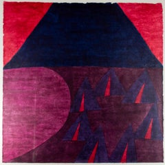
"Little Wolf's Last Camp, " Colored Woodblock A/P signed by Carol Summers

"Little Wolf's Last Camp, " Colored Woodblock A/P signed by Carol Summers

By Carol Summers

Located in Milwaukee, WI

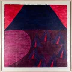
"Little Wolf's Last Camp" is a colored woodblock A/P signed by Carol Summers. In the image, a mountain looms over a circle of teat the edge of a lake, a scene likely inspired by the life events of the Northern Cheyenne Chief Little Wolf (c. 1820-1904) and his leadership during the Northern Cheyenne Exodus. The drama of the image is enhanced by Summers' signature printmaking technique, which allows the ink from the woodblock to seep through the paper, blurring the edges of each form. Frame: 37 x 37 in This is an artist's proof from the edition of 100 Carol Summers (1925-2016) has worked as an artist throughout the second half of the 20th century and into the first years of the next, outliving most of his mid-century modernist peers. Initially trained as a painter, Summers was drawn to color woodcuts around 1950 and it became his specialty thereafter. Over the years he has developed a process and style that is both innovative and readily recognizable. His art is known for it’s large scale, saturated fields of bold color, semi-abstract treatment of landscapes from around the world and a luminescent quality achieved through a printmaking process he invented. In a career that has extended over half a century, Summers has hand-pulled approximately 245 woodcuts in editions that have typically run from 25 to 100 in number. His talent was both inherited and learned. Born in 1925 in Kingston, a small town in upstate New York, Summers was raised in nearby Woodstock with his older sister, Mary. His parents were both artists who had met in art school in St. Louis. During the Great Depression, when Carol was growing up, his father supported the family as a medical illustrator until he could return to painting. His mother was a watercolorist and also quite knowledgeable about the different kinds of papers used for various kinds of painting. Many years later, Summers would paint or print on thinly textured paper originally collected by his mother. From 1948 to 1951, Carol Summers trained in the classical fine and studio arts at Bard College and at the Art Students League of New York. He studied painting with Steven Hirsh and printmaking with Louis Schanker. He admired the shapes and colors favored by early modernists Paul Klee (Sw: 1879-1940) and Matt Phillips (Am: b.1927- ). After graduating, Summers quit working as a part-time carpenter and cabinetmaker (which had supported his schooling and living expenses) to focus fulltime on art. That same year, an early abstract, Bridge No. 1 was selected for a Purchase Prize in a competition sponsored by the Brooklyn Museum. In 1952, his work (Cathedral, Construction and Icarus) was shown the first time at the Museum of Modern Art in New York City in an exhibition of American woodcuts. In 1954, Summers received a grant from the Italian government to study for a year in Italy. Woodcuts completed soon after his arrival there were almost all editions of only 8 to 25 prints, small in size, architectural in content and black and white in color. The most well-known are Siennese Landscape and Little Landscape, which depicted the area near where he resided. Summers extended this trip three more years, a decision which would have significant impact on choices of subject matter and color in the coming decade. After returning from Europe, Summers’ images continued to feature historical landmarks and events from Italy as well as from France, Spain and Greece. However, as evidenced in Aetna’s Dream, Worldwind and Arch of Triumph, a new look prevailed. These woodcuts were larger in size and in color. Some incorporated metal leaf in the creation of a collage and Summers even experimented with silkscreening. Editions were now between 20 and 50 prints in number. Most importantly, Summers employed his rubbing technique for the first time in the creation of Fantastic Garden in late 1957. Dark Vision of Xerxes, a benchmark for Summers, was the first woodcut where Summers experimented using mineral spirits as part of his printmaking process. A Fulbright Grant as well as Fellowships from the Louis Comfort Tiffany Foundation and the Guggenheim Foundation followed soon thereafter, as did faculty positions at colleges and universities primarily in New York and Pennsylvania. During this period he married a dancer named Elaine Smithers with whom he had one son, Kyle. Around this same time, along with fellow artist Leonard Baskin, Summers pioneered what is now referred to as the “monumental” woodcut. This term was coined in the early 1960s to denote woodcuts that were dramatically bigger than those previously created in earlier years, ones that were limited in size mostly by the size of small hand-presses. While Baskin chose figurative subject matter, serious in nature and rendered with thick, striated lines, Summers rendered much less somber images preferring to emphasize shape and color; his subject matter approached abstraction but was always firmly rooted in the landscape. In addition to working in this new, larger scale, Summers simultaneously refined a printmaking process which would eventually be called the “Carol Summers Method” or the “ Carol Summers Technique”. Summers produces his woodcuts by hand, usually from one or more blocks of quarter-inch pine, using oil-based printing inks and porous mulberry papers. His woodcuts reveal a sensitivity to wood especially its absorptive qualities and the subtleties of the grain. In several of his woodcuts throughout his career he has used the undulating, grainy patterns of a large wood plank to portray a flowing river or tumbling waterfall. The best examples of this are Dream, done in 1965 and the later Flash Flood Escalante, in 2003. In the majority of his woodcuts, Summers makes the blocks slightly larger than the paper so the image and color will bleed off the edge. Before printing, he centers a dry sheet of paper over the top of the cut wood block or blocks, securing it with giant clips. Then he rolls the ink directly on the front of the sheet of paper and pressing down onto the dry wood block or reassembled group of blocks. Summers is technically very proficient; the inks are thoroughly saturated onto the surface of the paper but they do not run into each other. The precision of the color inking in Constantine’s Dream in 1969 and Rainbow Glacier in 1970 has been referred to in various studio handbooks. Summers refers to his own printing technique as “rubbing”. In traditional woodcut printing, including the Japanese method, the ink is applied directly onto the block. However, by following his own method, Summers has avoided the mirror-reversed image of a conventional print and it has given him the control over the precise amount of ink that he wants on the paper. After the ink is applied to the front of the paper, Summers sprays it with mineral spirits, which act as a thinning agent. The absorptive fibers of the paper draw the thinned ink away from the surface softening the shapes and diffusing and muting the colors. This produces a unique glow that is a hallmark of the Summers printmaking technique. Unlike the works of other color field artists or modernists of the time, this new technique made Summers’ extreme simplification and flat color areas anything but hard-edged or coldly impersonal. By the 1960s, Summers had developed a personal way of coloring and printing and was not afraid of hard work, doing the cutting, inking and pulling himself. In 1964, at the age of 38, Summers’ work was exhibited for a second time at the Museum of Modern Art. This time his work was featured in a one-man show and then as one of MOMA’s two-year traveling exhibitions which toured throughout the United States. In subsequent years, Summers’ works would be exhibited and acquired for the permanent collections of multiple museums throughout the United States, Europe and Asia. Summers’ familiarity with landscapes throughout the world is firsthand. As a navigator-bombardier in the Marines in World War II, he toured the South Pacific and Asia. Following college, travel in Europe and subsequent teaching positions, in 1972, after 47 years on the East Coast, Carol Summers moved permanently to Bonny Doon in the Santa Cruz Mountains in Northern California. There met his second wife, Joan Ward Toth, a textile artist who died in 1998; and it was here his second son, Ethan was born. During the years that followed this relocation, Summers’ choice of subject matter became more diverse although it retained the positive, mostly life-affirming quality that had existed from the beginning. Images now included moons, comets, both sunny and starry skies, hearts and flowers, all of which, in one way or another, remained tied to the landscape. In the 1980s, from his home and studio in the Santa Cruz mountains, Summers continued to work as an artist supplementing his income by conducting classes and workshops at universities in California and Oregon as well as throughout the Mid and Southwest. He also traveled extensively during this period hiking and camping, often for weeks at a time, throughout the western United States and Canada. Throughout the decade it was not unusual for Summers to backpack alone or with a fellow artist into mountains or back country for six weeks or more at a time. Not surprisingly, the artwork created during this period rarely departed from images of the land, sea and sky. Summers rendered these landscapes in a more representational style than before, however he always kept them somewhat abstract by mixing geometric shapes with organic shapes, irregular in outline. Some of his most critically acknowledged work was created during this period including First Rain, 1985 and The Rolling Sea, 1989. Summers received an honorary doctorate from his alma mater, Bard College in 1979 and was selected by the United States Information Agency to spend a year conducting painting and printmaking workshops at universities throughout India. Since that original sabbatical, he has returned every year, spending four to eight weeks traveling throughout that country. In the 1990s, interspersed with these journeys to India have been additional treks to the back roads and high country areas of Mexico, Central America, Nepal, China and Japan. Travel to these exotic and faraway places had a profound influence on Summers’ art. Subject matter became more worldly and nonwestern as with From Humla to Dolpo, 1991 or A Former Life of Budha, 1996, for example. Architectural images, such as The Pillars of Hercules, 1990 or The Raja’s Aviary, 1992 became more common. Still life images made a reappearance with Jungle Bouquet in 1997. This was also a period when Summers began using odd-sized paper to further the impact of an image. The 1996 Night, a view of the earth and horizon as it might be seen by an astronaut, is over six feet long and only slightly more than a foot-and-a-half high. From 1999, Revuelta A Vida (Spanish for “Return to Life”) is pie-shaped and covers nearly 18 cubic feet. It was also at this juncture that Summers began to experiment with a somewhat different palette although he retained his love of saturated colors. The 2003 Far Side of Time is a superb example of the new direction taken by this colorist. At the turn of the millennium in 1999, “Carol Summers Woodcuts...

Category

1970s Contemporary Alkyd Landscape Prints

Materials

Woodcut

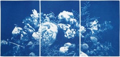
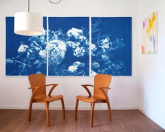
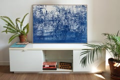
Floral Triptych of Large Floral Bouquet, Botanical Cyanotype in Classic Blue

Floral Triptych of Large Floral Bouquet, Botanical Cyanotype in Classic Blue

By Kind of Cyan

Located in Barcelona, ES

This series of cyanotype triptychs showcases the beauty of nature scenes, including stunning beaches and oceans, as well as the intricate textures of water, forests, and skies. These...

Category

2010s American Realist Alkyd Landscape Prints

Materials

Watercolor, Lithograph, Paper

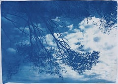
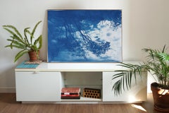
Malibu Pine Sea View, Blue Tones California Landscape, Handmade Cyanotype, Paper

Malibu Pine Sea View, Blue Tones California Landscape, Handmade Cyanotype, Paper

By Kind of Cyan

Located in Barcelona, ES

This is an exclusive handprinted limited edition cyanotype. Stunning image of a breezy "Malibu Pine Sea View". Details: + Title: Malibu Pine Sea View + Year: 2025 + Edition Size: 50...

Category

2010s Realist Alkyd Landscape Prints

Materials

Watercolor, Lithograph, Monotype

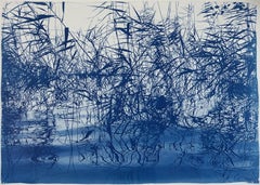
Mystic Louisiana Marsh Landscape in Blue Tones, Limited Edition Cyanotype Print

Mystic Louisiana Marsh Landscape in Blue Tones, Limited Edition Cyanotype Print

By Kind of Cyan

Located in Barcelona, ES

This is an exclusive handprinted limited edition cyanotype. Exquisite landscape of a "Mystic Louisiana Marsh". Details: + Title: Mystic Louisiana Marsh + Year: 2025 + Edition Size:...

Category

2010s Realist Alkyd Landscape Prints

Materials

Watercolor, Lithograph, Monotype

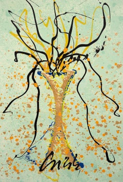
Venetian Series, Dale Chihuly

Venetian Series, Dale Chihuly

By Dale Chihuly

Located in Fairfield, CT

Artist: Dale Chihuly (1941) Title: Venetian Series Year: 2018 Medium: Lithograph, silkscreen and acrylic on Waterford paper Edition: 79/125 Size: 37 x 25 inches Inscription: Signed a...

Category

2010s Abstract Alkyd Landscape Prints

Materials

Acrylic, Intaglio, Screen, Lithograph
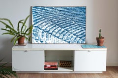
Serene Cove Ripples, Mediterranean Seascape Diptych in Blue & White, Cyanotype

Serene Cove Ripples, Mediterranean Seascape Diptych in Blue & White, Cyanotype

By Kind of Cyan

Located in Barcelona, ES

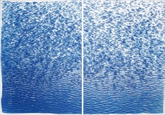
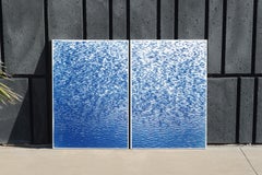
This is an exclusive handprinted limited edition cyanotype. "Serene Cove Ripples" is a gorgeous original cyanotype diptych showing calming sea ripples in a Mediterranean cove. Details: + Title: Serene Cove Ripples + Year: 2022 + Edition Size: 100 + Medium: Handmade Cyanotype Print on Watercolor Paper + Stamped and Certificate of Authenticity provided + Measurements : 100x140 cm (40 x 55.2 in.) Each paper measures 70x100 cm (28x 40 in.) each, a standard frame size + All cyanotype prints are made on high-quality Italian watercolor paper WHAT IS A CYANOTYPE? The cyanotype (a.k.a. sun-print) process is one of the oldest in the history of photography, dating back to the 1840's. Cyanotypes were then made famous by Anna Atkins...

Category

2010s Post-Impressionist Alkyd Landscape Prints

Materials

Watercolor, Lithograph, Paper

Lake Tahoe Panorama,  Minimal Blue Tones Cyanotype Print on Watercolor Paper

Lake Tahoe Panorama, Minimal Blue Tones Cyanotype Print on Watercolor Paper

By Kind of Cyan

Located in Barcelona, ES

This is an exclusive handprinted limited edition cyanotype. "Lake Tahoe Panorama" shows a sequence of abstracted ripples of the calm Tahoe waters. Details: + Title: Lake Tahoe Panor...

Category

2010s Minimalist Alkyd Landscape Prints

Materials

Watercolor, Lithograph, Paper

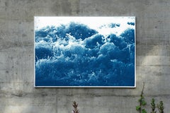
White and Blue Abstract Nautical Cyanotype of Crashing Waters, Coastal Lifestyle

White and Blue Abstract Nautical Cyanotype of Crashing Waters, Coastal Lifestyle

By Kind of Cyan

Located in Barcelona, ES

This is an exclusive handprinted limited edition cyanotype. "Abstract Crashing Water" is an original cyanotype that detailed portraits the eruptions and shapes of salty water in move...

Category

2010s Abstract Alkyd Landscape Prints

Materials

Watercolor, Lithograph, Paper

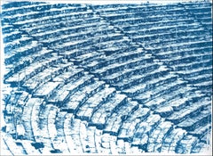
Greek Architecture Blueprint of Ancient Amphitheatre Cyanotype Print, Watercolor

Greek Architecture Blueprint of Ancient Amphitheatre Cyanotype Print, Watercolor

By Kind of Cyan

Located in Barcelona, ES

This is an exclusive handprinted limited edition cyanotype. Details: + Title: Ancient Roman Amphitheater + Year: 2022 + Edition Size: 50 + Stamped and Certificate of Authenticity provided + Measurements : 70x100 cm (28x 40 in.), a standard frame size + All cyanotype prints...

Category

2010s Academic Alkyd Landscape Prints

Materials

Photographic Film, Emulsion, Watercolor, C Print, Lithograph, Monotype, ...

Alkyd landscape prints for sale on 1stDibs.

Find a wide variety of authentic Alkyd landscape prints available on 1stDibs. While artists have worked in this medium across a range of time periods, art made with this material during the 20th Century is especially popular. There are many well-known artists whose body of work includes ceramic sculptures. Popular artists on 1stDibs associated with pieces like this include Antonio Frasconi, and Reginald Marsh. Not every interior allows for large Alkyd landscape prints, so small editions measuring 0.01 inches across are also available